


Madison Carpenter Jewelry
Designing a responsive e-commerce website for an online jewelry shop to improve user engagement and conversion rate.
My Role: UX Research, UX/UI Design, UX Strategy
Collaboration with: UX Manager, Stakeholder
Duration: 3 weeks (120 hours) 2022
Design Tool Kit: Figma, Miro, Slack, Notion
The Business’ Mission: ‘‘ Empowering Women ‘‘
MADISON CARPENTER JEWELRY
Madison Carpenter is a hand-crafted jewelry business owned by creator Madison. She has been designing and selling her creations since 2019 through special events and online platforms. She describes her brand as modern southwestern, boho, and minimalistic.
The company doesn't have a physical store and relies on its online presence for revenue. Madison Carpenter Jewelry is already quite popular on Instagram, while its website had relatively low traffic and a high bounce rate.
The Current Website Is Underperforming!
PROBLEM
Due to budget constraints, I had to use the existing jewelry photographs, which limited the UI design approach throughout the process.
CONSTRAINTS
Create a user-friendly checkout process, efficient browsing, and intuitive navigation to delight the online shopping experience that will increase customer engagement and conversion rates. Design a website that reflects the brand identity.
SOLUTION

HOW DID I GET TO THIS SOLUTION?
~RESEARCH
Stakeholder Interview

To understand the business goals and needs, I started the project by conducting an interview with the stakeholder Madison Carpenter to explore the brand and business.
Responsive website that reflects the modern western and boho look
User-friendly checkout
An interactive home page that makes the customer explore
Business Needs:
Maximize customer engagement
Increase the conversion rate
Improve checkout process
Business Goals:
Understanding the Market
What’s Important in Jewelry E-commerce Market?

Personalized Suggestions = Customer Satisfaction Providing personalized product recommendations makes searching more effective.

Jewelry is often purchased or received as a gift (43%) rather than as a self-purchase (22%). The gift option is extra important for the jewelry industry.

The detailed product description is an essential element in jewelry e-commerce.

Poor Visual Design = High Bounce Rate It’s important to make the design easy on the eyes and easy to use.
Learning From Competitors
I created a competitive analysis to determine potential opportunities with direct competitors producing hand-crafted jewelry in America. I focused on the experience of the website navigation and carrying a product to the checkout process.

Providing product details is especially important for jewelry e-commerce.
That means an effective visual hierarchy will be crucial for ease of use and a pleasing visual aesthetic.
Attitudinal Research
I conducted 4 in-depth user interviews. I recruited people with online jewelry shopping experiences and those who preferred to buy jewelry in-store so that could explore what stops people from buying jewelry online. I chose the participants from the stakeholder’s targeted customer segment; people who live in America and are between the ages of 24 and 35.
Understanding Jewelry Consumers
Key Insights:

Before buying jewelry, users want to know more about the shipping and return policies. Shipping and return policies must be clearly stated on every product page.
Non-transparent Shipping & Return Policy

People, especially those with skin allergies, need detailed information about the jewelry before they purchase it. This is also one of the biggest reasons why some people don't prefer jewelry shopping online.
The Lack of Product Details

People need an easy and seamless checkout process without account registration. This will also have a huge impact on increasing the conversion rate.
Complicated Checkout Process
Defining the Persona
After synthesizing the feedback from user interviews and market research, I created a persona for consistency in my design decisions and effective communication with the team member.
Meet Bohemian Fashionista Nicole!
Understanding Nicole’s Perspective
Creating user journeys helped me gain insight into how our persona Nicole interacts with jewelry sites and what she finds frustrating or helpful.
How might we provide an effortless and delightful online shopping experience for jewelry consumers to increase engagement and conversion rate?
~DEFINE
Key Features
Detailed and compelling product page
Transparent shipping & return policy
Guest check out
Providing customer reviews
Confirmation e-mail/page for checkout
In order to improve jewelry shopping experience and conversion rate, key features to include in the solutions are:
How Does Nicole Find Her Way to Purchasing Fabulous Earrings?

After identifying the features, I explored how Nicole might interact with Madison Carpenter’s website. The user flow is focused on navigating to find a set of earrings for purchase.
Sitemap
~IDEATE
The First Digitized Approach


Merging the user experience with boho, modern western, and minimalist brand identity.
While creating the user interface, I paid attention to the business mission: Empowering Women and brand identity: Boho, Modern Western, Minimal, and Earthy. I ensured the color and text contrast ratios using the WebAIM Contrast Checker.
UI Kit to Make a Consistent Product
The usability test proves that the check-out process was easy to accomplish, and the first impression matches the brand identity.
~VALIDATE
After designing the high-fidelity for the main flow, I wanted to observe how real people would use the new product. I conducted 4 remote moderated usability testing through Zoom. I recruited participants between the ages of 24 and 35 who have online jewelry shopping behaviors.
High-Fidelity Prototype Usability Testing
Test Objectives

Evaluate the interaction with Madison Carpenter’s website.
Identify the pain points and opportunities to iterate the design.
Have a better understanding of how easy and quick to accomplish the task.
Tasks

Find White Casper Earrings
Add Gift Wrap
Add a Message
Purchase It as a Guest
Key Findings
100%
All participants accomplished the task of purchasing an earring as a gift with ease.
Users enjoyed the look & feel, and the first impression was described as boho and western.
Task Completion Rate
60%
Users expressed their confusion about log-in and sign-up links on checkout.
Sign-up and Log-in Conflict
After choosing the gift option, price changes confused some of the users.
They wanted to see breakdowns of charges for adding gift boxing.
Need Clarification on Price Change
50%
Prioritizing the Improvements
Iterations
Being More Transparent on Price Adjustments
BEFORE
AFTER
Preventing the Confusion and Seamlessly Promoting Sign-up Action
BEFORE
AFTER
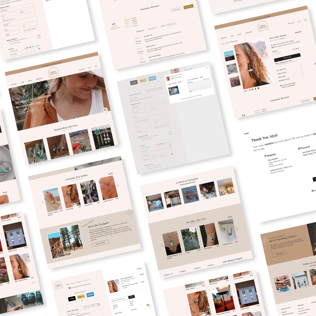
Final Design

Interactive Home Page | Detailed Product Page | Intuitive and Simple Checkout
The new design hasn’t been implemented on the site yet. However, we will know if the redesign was successful if the business sees the following:
Decrease the cart abandonment rate to 25%
Increase the conversion rate between 1% - 4%
Increase ROI (return on investment) to 7%
Measuring Success
The final design presentation with the stakeholder went pretty successfully, and she was delighted with the new look and feel of the website.
However, working directly with a stakeholder on this project taught me some important lessons about designing for clients. First of all, collaborating remotely requires efficient communication and planning. This is especially crucial if you work in different time zones. The second lesson was how important it was to gather the visual assets beforehand for the project. I had to spend lots of time figuring out product visuals from different sources to create a pleasing visual design.
Overall, I enjoyed learning deeper about the jewelry industry and working with a client on this project.

